Wrong Letter, Full Room: Why I've Stopped Waiting to Be Proud of My Marketing
Photo: Linda Bailey, CC BY-SA 2.0, via Wikimedia Commons
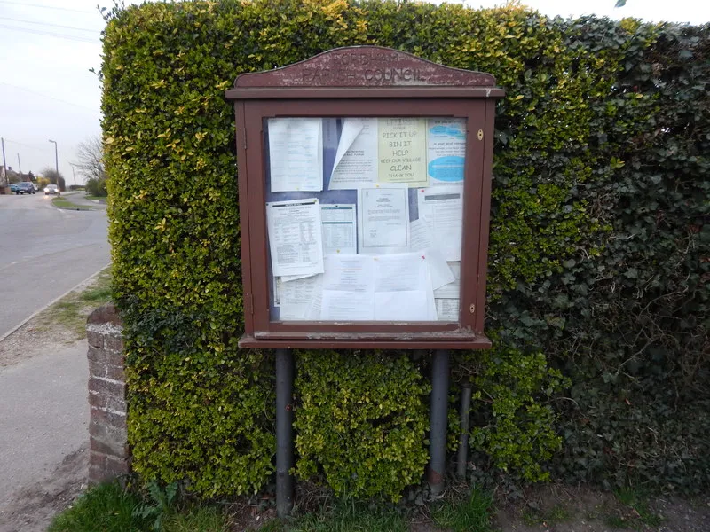
There's a noticeboard outside the village hall near me, the kind with a Perspex front that's gone slightly cloudy with age and a padlock so rusted nobody's opened it since the Queen's jubilee. Last month someone had Blu Tacked a poster to the outside of it, because the key is lost, and the poster had been rained on so many times it had gone the texture of a crisp packet.
It read: "Village Hall Committee Prsents: An Evening With Local Author, Thurs 7.30, £4 on the door, tea included."
Prsents. Not presents. Not a font choice anyone signed off. The lettering had been done in Word, in what I'm fairly sure was Comic Sans, and the little clip-art book in the corner had been stretched out of shape, so it looked like a paperback that had been sat on.
The room was full. Not politely full. Chairs-from-the-kitchen full.
I've been thinking about that poster for three weeks now, because it did the thing that most of my own marketing spends months failing to do. It got a specific group of people into a specific room at a specific time, and it did it with a spelling mistake in the headline.
The poster was bad, and that isn't the interesting part
It's tempting to turn this into a story about how scrappy charm beats corporate polish. There's something in that, but it's not quite the lesson, because I've seen plenty of scruffy posters that sold nothing. The room wasn't full because the poster was endearing. Nobody drove to the village hall out of affection for Comic Sans.
It was full because the poster answered four questions before you had time to walk past it. What is it. When is it. Where is it. How much.
That's it. That's the whole trick. Four answers, a wrong letter, and a piece of clip art that looked like it had been through a laundry cycle.
Compare that to the last three things I "launched" properly. A side project I spent six weeks getting ready: logo, colour palette, a holding page, a proper domain, a launch post I rewrote eleven times. It went out to a modest ripple and I quietly retired it in March. Meanwhile a scruffy one-page thing I threw together on a Tuesday evening, with the default font and a typo in the second paragraph that a reader kindly emailed me about, is still getting replies now, in November 2026.
I don't like that. But I've stopped arguing with it.
The polished void
Here's the pattern I see in myself, and in about every independent worker I've had a pint with this year. The gap between having a thing and telling anyone about the thing gets filled with preparation. And preparation feels like work, so it never gets flagged as delay.
You need the website first. Well, you need the website to be right. Well, the logo is a bit amateur, so maybe get that redone. And the About page needs a proper photo, not the one from 2019 where you're squinting. And the domain — actually, is the domain right? Maybe a shorter one.
Six weeks later the thing itself has gone cold and you've got a very tidy holding page that says Something is coming. Which, in the end, is a promise to do marketing later.
A holding page is the most honest form of not telling anyone.
What a rained-on poster understands that a brand document doesn't
Three things, near as I can tell.
It's local. The poster didn't try to reach everyone. It reached people who walk past that hall — the same forty or fifty households, plus whoever uses the Co-op car park. Precision beats reach when your reach is zero.
It's dated. Thursday, 7.30. Not "coming soon". Not "launching this autumn". A specific evening with a specific price, which is the thing that makes a person move an evening around in their head.
It's already up. This is the one that matters. The poster doesn't get better by sitting in a drawer. Every day it's on the noticeboard is a day someone might read it and come. Every day it's in the drawer is a day nobody does.
What I'd actually do this week
I've started keeping a short list for myself, and I'll hand it over in case it's useful. It's not a strategy. It's a set of rules for getting something out the door before Friday.
- Pick one room, one evening, one price. Even if the room is a mailing list, a subreddit, a WhatsApp group of eleven people, or the actual back room of a pub. Vague audiences produce vague silence.
- Write the four answers first, in plain sentences, before you touch the design. What it is, when it is, where it is, what it costs. If you can't fill those in yet, you're not ready to market — you're ready to plan, which is different.
- Use the tools you already have. The default document template, the free tier of the newsletter platform, the domain you bought two years ago and never pointed anywhere. Nobody is grading the finish.
- Give it a date even if the date is uncomfortable. A date you have to honour is worth more than a plan you can defer.
- Ask one person to read it for errors. One. The typo on my poster's cousin is survivable, but a broken link isn't.
- Put it up somewhere real, today, and leave it up. Not a draft. Not scheduled for the 1st of next month. Up.
The bit I'm still working on
I'll be honest, I haven't fully shaken the urge to polish. There's a version of me that would still rather spend a Sunday on a typeface than send an email to twelve people who might say no. Polishing is comfortable. It has an end point you can see, and nobody ever judged anyone for caring about kerning.
But the village hall poster keeps coming back to me, damp and misspelt and stuck to the outside of a locked noticeboard by someone who had simply decided that the evening was happening whether the design was finished or not.
Thirty-odd people turned up in the rain. Tea was included. I don't think a single one of them mentioned the missing 'e'.
If you've got something half-built and a spare forty minutes this week, the noticeboard's still there. So is the internet, come to that, and neither of them mind a spelling mistake.